


Good morning all,
I am just sharing this project as a proof of concept in case anyone is interested in achieving something similar.
Utilizing Incident IQ’s API to collect the data, I developed a fully automated and fully customizable dashboard that updates every 15 minutes and can be filtered and sorted any way we need. The plan is to continue building this out to contain many more KPIs and data points from a variety of departments. The long-term goal is to curate data from many sources into a digestible format for the administration and Board in our district.
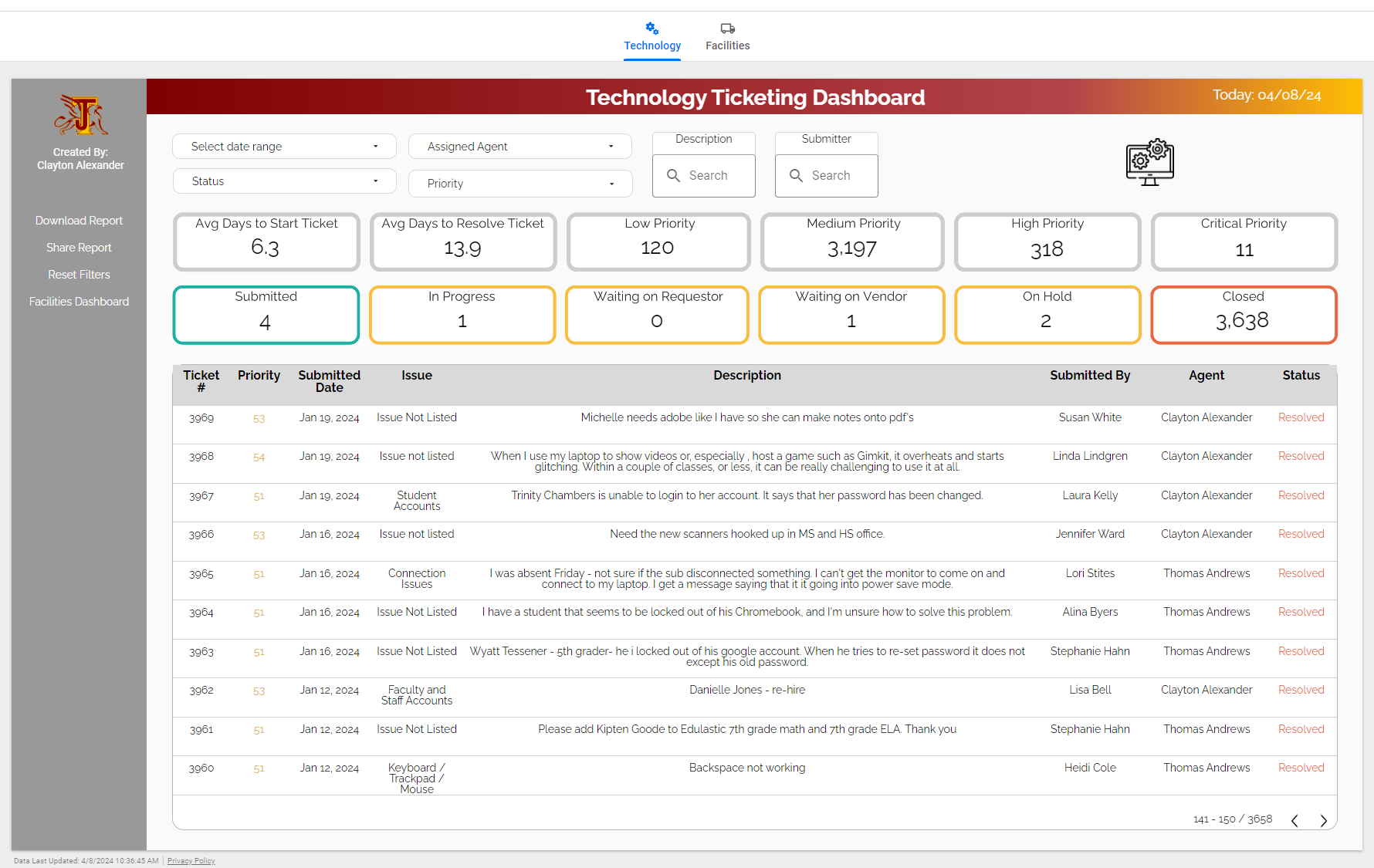
The specific dashboard pictured above is run strictly using Google Sheets, Google Apps Script, and Looker Studio (Google Data Studio) but something similar can be created in any popular data visualization tool (Power BI, Tableau, etc.). I try to focus on the information presented rather than the design and to focus on a specific problem to solve. This view above is still in development and tailored for an operational manager to get an overview at a glance on how a department or a specific agent is performing and identify trends for potential improved efficiency, but should not be used as evidence for a performance review since too many factors aren’t considered here yet.
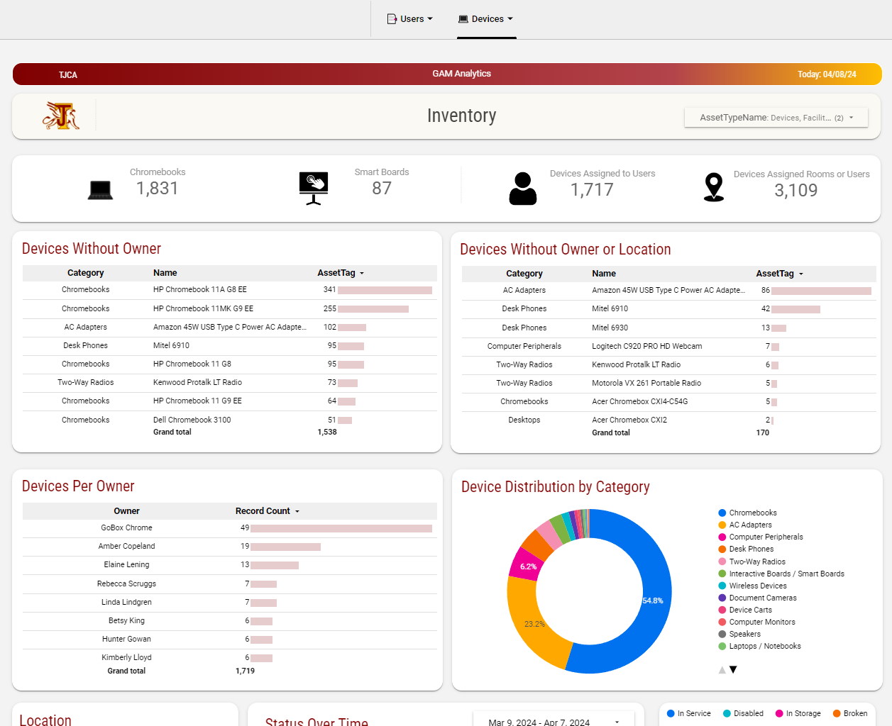
To keep this post related to Incident IQ, you can create a wide variety of dashboards for monitoring inventory status and location depending on what you’re focused on improving. But to take it a step further, you can also incorporate data from multiple sources in the same visual. For example, data from Google Admin Console or your SIS. Here is another sample from a dashboard that we used to get further info on what devices we have and where they’re located across our district.
Feel free to reach out if you have any questions about the capabilities or the setup process. Thanks for reading!


