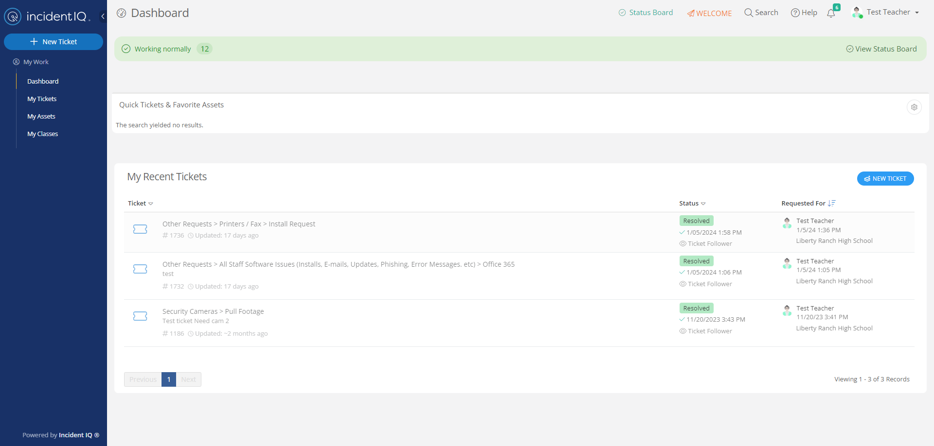
How can I remove the blue “Help & Tips” vertical tab on the right-hand side of the screen? I’m constantly fighting that thing as I try to scroll the window underlying it. It’s completely useless since there is already a “Help” button at the top of the screen.
Hey
We are unable to remove the Help & Tips tab on the right-hand side. We are aware it is covering the scroll bar and we are working on a solution for this. Apologizes for any inconvenience this is causing.
Hi
I’d like to support Stan here. This tab is having a profoundly negative impact on rolling this system out to users. The narrow and lightly shaded scroll bars are already a challenge for users without a touch screen, but this tab is causing a great deal of frustration.
Have you been able to make any progress on this in the last two months? We would be willing to beta test any solutions you have in progress.
Thanks for listening!
Thank you for your input. We are still looking into this. Apologizes for any inconvenience this has caused your users.
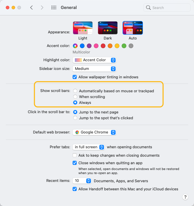
For any users using a mac book. There are settings that you can adjust to see the scroll bar.
Under system preferences -> general
Fully agree - the tab is in a ridiculous location - constantly in the way!!!!!!
Thank you for your feedback
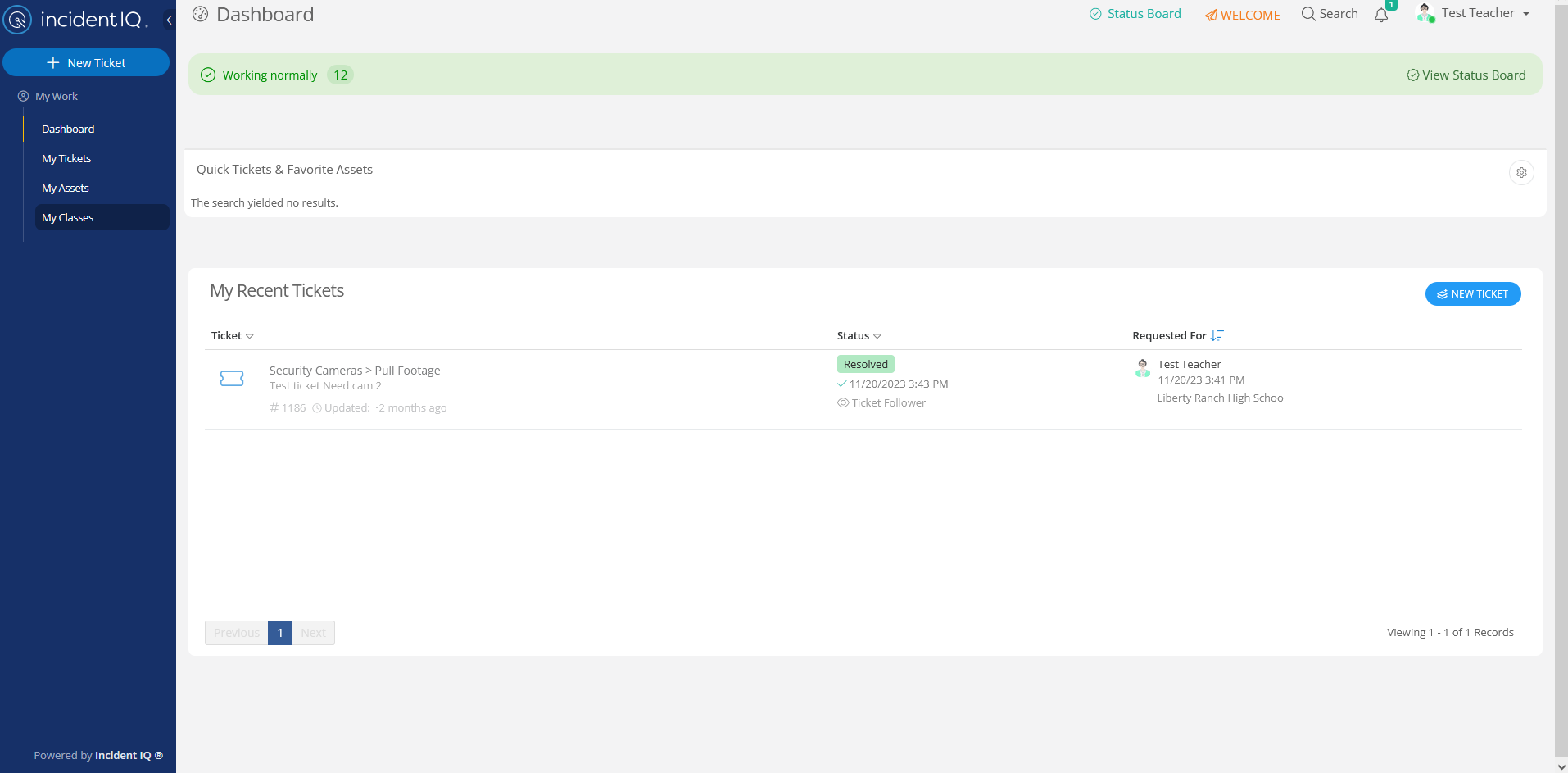
Here is our solution to this issue.
In site settings, for both Faculties and Tickets we turned off Enable help for Requestors, you can also do this for Agents.
Does that not turn off Help entirely? Looking at your screenshot, it looks like the “Help” option that’s normally at the top of the screen is gone now. We don’t want to do that; we just want to get rid of the tab that’s in the way of the scroll bar.
The Flyout seems to be gone no matter on toggle now, yes it would remove both the flyout and button so this is interesting I wonder if they made a change or if I have an ALT setting someplace.
Well, I guess we’ll just keep dodging the tab until enough people complain about it so that it is removed. I can’t believe anyone who uses the product on a daily basis would think the advantages of having it outweigh the disadvantages. It is a constant nuisance.
Hello. We just started using this product and I agree - the Help & Tips right nav tab is in an inconvenient location. Is there a way to move it or hide it, but still keep the help button at the top?
Here is our solution to this issue.
In site settings, for both Faculties and Tickets we turned off Enable help for Requestors, you can also do this for Agents.
How do you get to “Site settings”, I only see an options link and then it gives me a search bar under a “Settings” header. But that crazy because I don’t know what to search for. They should just SHOW the settings options instead of making us guess at what they might have called it.
The setting is called “enable help for requestors,” as
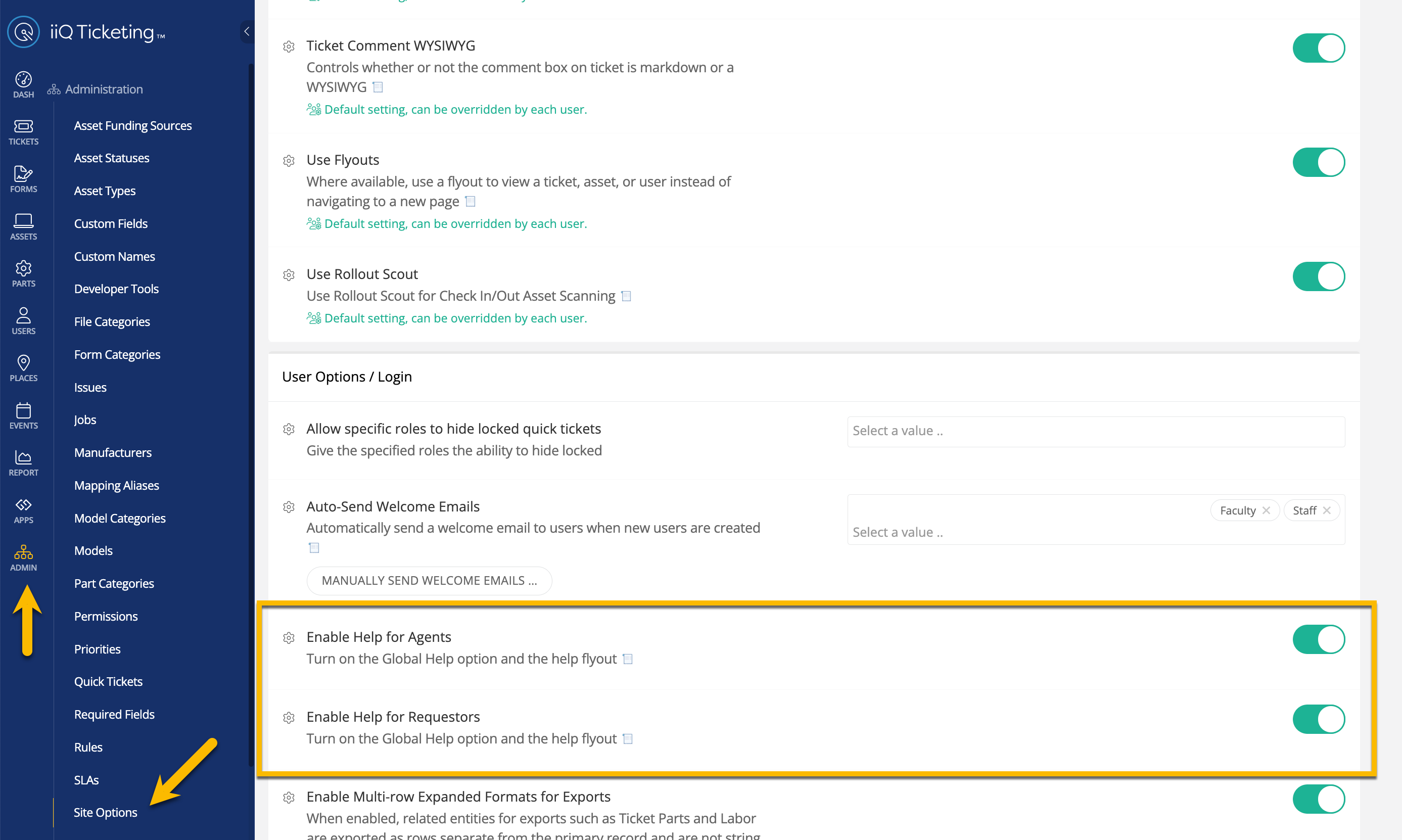
If you have any additional questions, please let me know
Yeah, I don’t have admin rights so I can’t adjust it.
Reply
Enter your E-mail address. We'll send you an e-mail with instructions to reset your password.