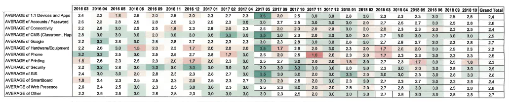

In a previous platform, I created a heat map to show issues by category over time. Weeks across the top. Issues down the left side. The intersection showed a number (average tickets for that category per day times a multiplier for urgency) and a color code, Dark green (few or no issues) to dark red (many issues). The total column indicated an area with cronic issues. Not shown is a “This week(s) last year(s)” to show a tearly trend. Just wondering whats possible.