In a previous platform, I created a heat map to show issues by category over time. Weeks across the top. Issues down the left side. The intersection showed a number (average tickets for that category per day times a multiplier for urgency) and a color code, Dark green (few or no issues) to dark red (many issues). The total column indicated an area with cronic issues. Not shown is a “This week(s) last year(s)” to show a tearly trend. Just wondering whats possible.


@JohnMeyerLSUU Thank you for submitting your question to our community! 😄

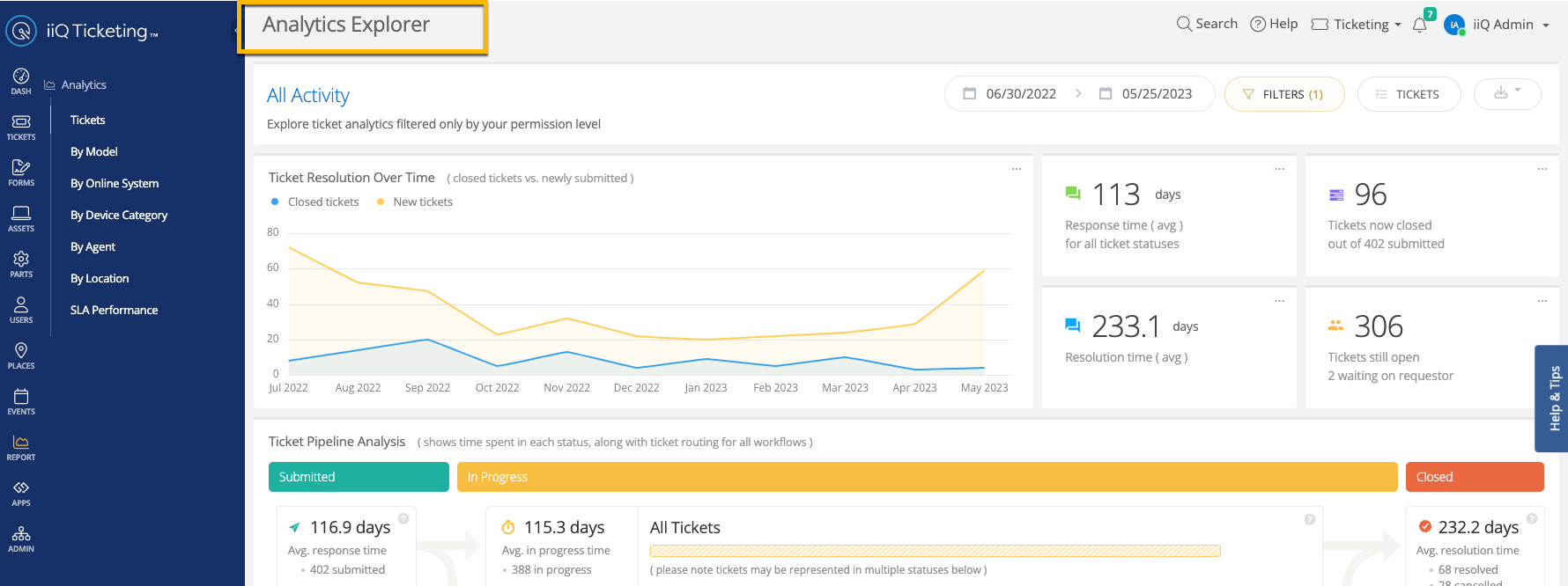
Have you checked out our Analytics Explorer? It does not give something above but it does provide data about your tickets. You can add various filters as well by agent or issue. 

Additionally, there are ideas in our Idea Exchange about enhancing our analytics. Here is one:

I hope this helps


The Analytics Explorer is nice but it tells me about my people, not about what is generating the tickets and how those causes ebb and flow. I would like a like dashboard heat map and I can’t get that if I have to export the data and import into a data visualizer.


@JohnMeyerLSUU That is an enhancement request that you can submit here: https://community.incidentiq.com/ideas


Reply