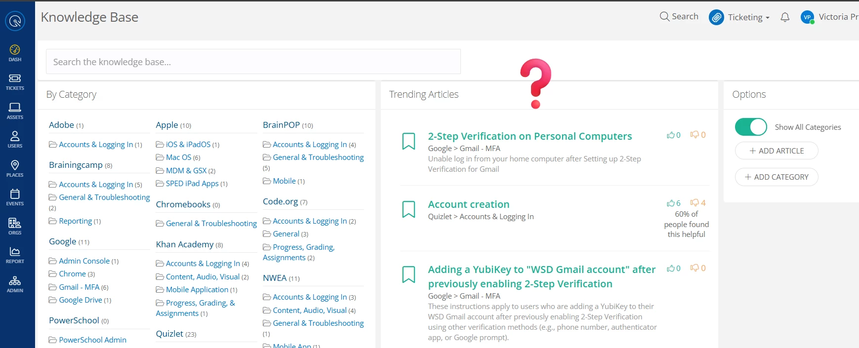

Our IT department is discussing how we can better utilize the Knowledge Base to help our end users. We discovered that my Knowledge Base view is completely different than the rest of my department and I have no idea why or how to change it! Everyone else’s screen looks just like the screenshots in the “How to” guides provided on using the Knowledge Base. Mine is divided into 3 sections with Trending Articles taking up the largest porting in the middle of the screen! It almost looks like I’m on an older version of the product, but it’s a district account and the appearance is the same even when logging into a different browser.